A New Look for our Cultural Places Website
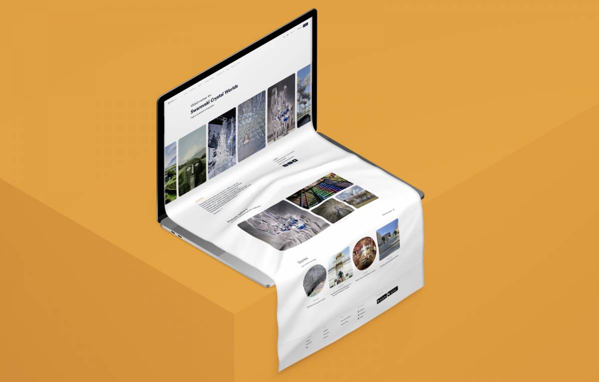
Have you noticed that the Cultural Places’ website has a new look? We are happy to provide you with an improved design and usability to get the most out of your cultural experiences. Learn more about the process behind the scenes in this week’s blogpost!
The Pandemic and Growing our Platform
It all began in the spring of 2020 when the pandemic hit. After some time, it was clear that we won’t be able to go back to business as usual soon and that the spread of COVID-19 was more serious and would have long-term effects on many people and businesses. So we decided to offer our content not only via our app, but also on a brand-new website! Cultural Places aimed to become a platform for the cultural and tourism sectors and support artists, museums, cultural businesses, and others during hard times. We also launched the projects #WeAreAllCulture and #HelpingWithCulturalPlaces to support those in need.
However, there was not much time, and we needed to rush things a bit to provide a platform as soon as possible. We managed to come up with a new website in record time! But the urge to rethink and redesign soon arose.

Rethinking
At first, we took a look at the old website to identify the most urgent needs and set priorities for the process of redesigning. We also needed to think of our target audience – has it changed? Will there be a different audience for the website than for the app? What do they want and need?
We want to create a platform for culturally interested travel fans as well as organizations from the art, culture, and tourism sectors alike. Our website is for everybody whose heart beats for art and culture!
Redesigning the Cultural Places Website
After we defined the needs and set new goals, our UX/UI-designers Igor Kovačević and Marko Jotić started with the first drafts. The main focus was on improving the user experience. Our website visitors should easily find their way around, due to a simplistic, clean design and a user-friendly flow. Therefore, we refreshed our website’s style and look-and-feel, changed the structure, and improved how users navigate through the pages.
There are several types of content for our users to explore: information and inspiration about destinations and cultural organizations in Austria as well as in other European cities and countries, digital audio guides, information pages, and pages about our projects #WeAreAllCulture and #HelpingWithCulturalPlaces, as well as about our initiative “Digitalizing Culture,” launched in 2021.

Outcome
We already had a lot of content, especially in our app, where we are currently offering around a hundred digital guides and a lot more. To include these, apply new designs to the existing content, and display it in a visually appealing way without being cluttered was not an easy task! Some new designs are still to be published, especially the guides, which have been the most challenging, but also the favorite parts for our designers. User experience is crucial here, and different kinds of content have to be displayed in a way the users can navigate easily and enjoy the guides obstacle-free. Cultural Places’ designers spent a lot of time researching and creating prototypes with different versions until they found the best solution. As a plus, there are two types of guides: one for indoor (mostly tours through museums and exhibitions) and one for outdoor (e.g. city walking tours). They have a lot in common, but are also structured differently. The new designs are almost done, and we can’t wait to finally publish them to present our digital guides in a new and vibrant way!
A central topic is the display of pictures, so we decided to give our picture galleries a new look. Photos, illustrations, and more will soon be displayed in a way that will make you enjoy them more than ever. The pictures on the destinations and organizations pages are now also presented in a fresh and exciting way.
If you are curious now, check out our new website – especially our homepage and the page for destinations and organizations. The search function was also reworked and is now much easier to use. We’ll keep you posted on the newest developments, so stay tuned!


